Jacob Hashimoto's Skyfarm Fortress
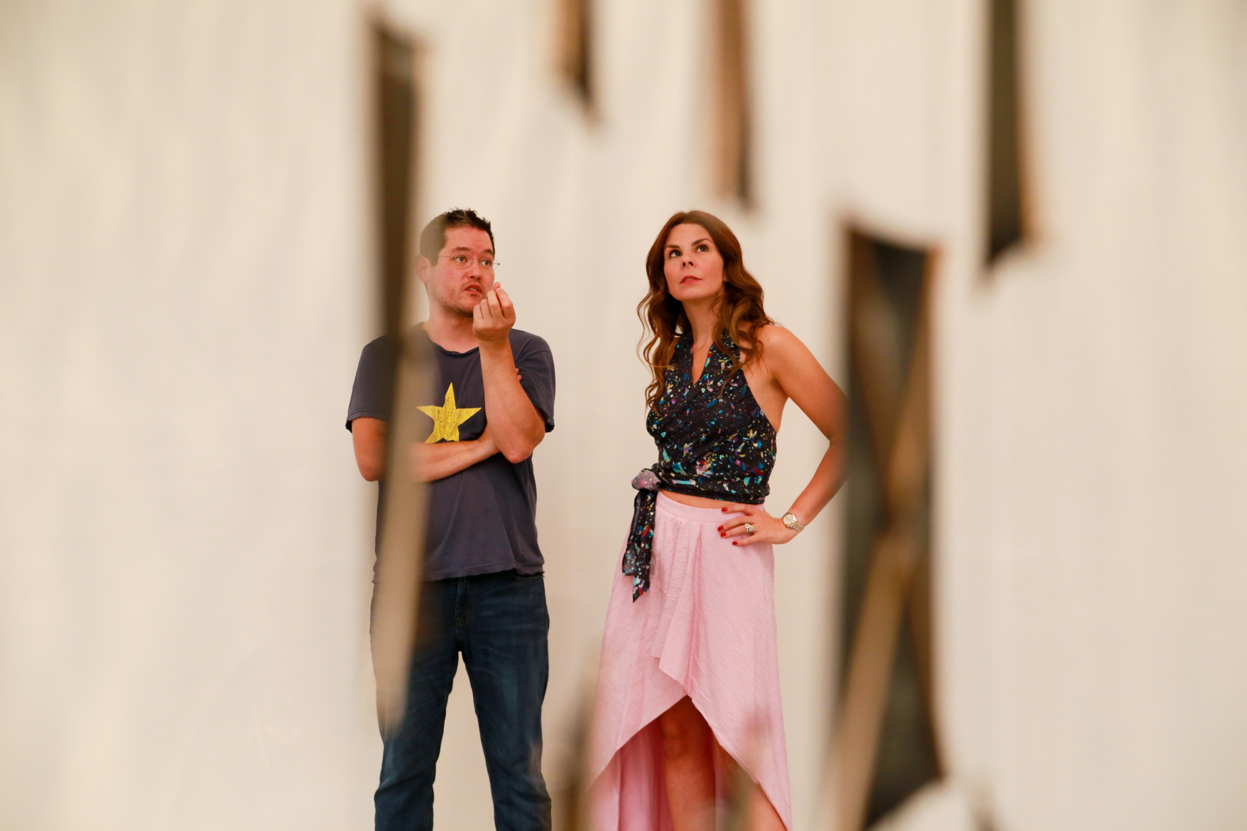
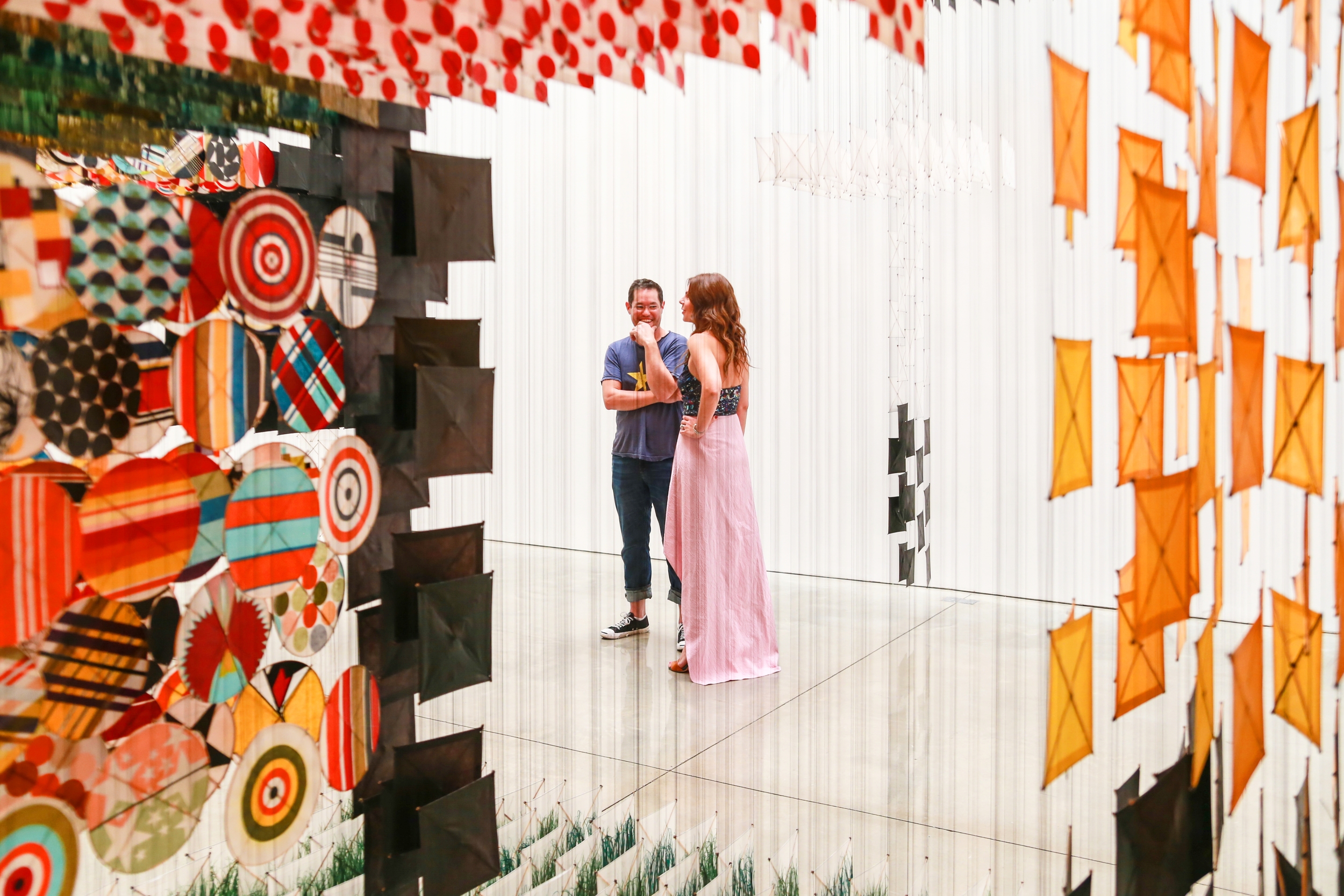
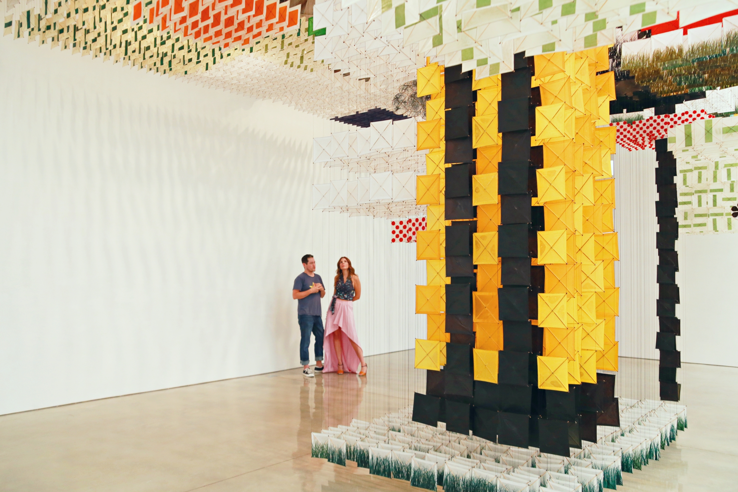
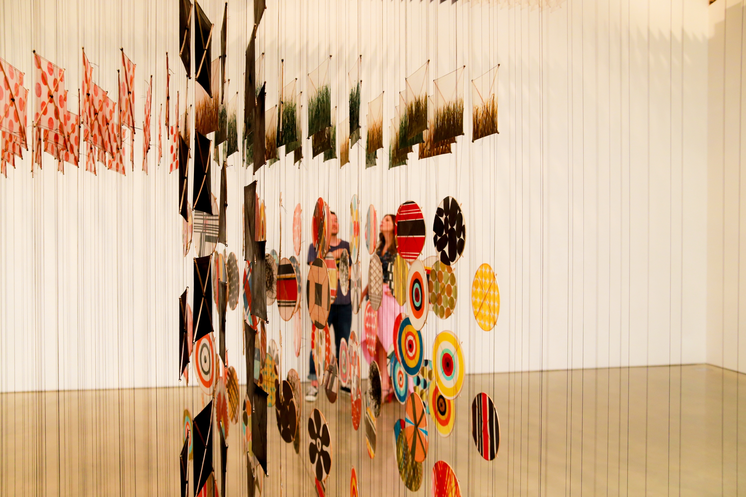
Jacob Hashimoto constructed a 34-foot-tall three-dimensional building inside of Mary Boone Gallery on 24th Street. More than 15,000 kites hang from the ceiling - there are circles, squares and hexagons, some multicolored with designs and patterns, some in solid vibrant hues. There is magic in the geometry of translucency and it's an immersive experience that embraces the spectator shape after shape. This is Hashimoto’s first East Coast site-specific installation and it serves as a counterpoint to his immense Gas Giant that opened at MOCA Pacific Design Center in Los Angeles in March 2014. I was lucky enough to chat with him about his installation and gain some additional insight into his inspirations and process.
Maria Brito: I read somewhere that in building this installation you got some inspiration from Minecraft. That’s brilliant and so current. I can see some of the parallels with the super popular video game.
Jacob Hashimoto: I have been looking at video games for a long time; there are a lot of artists looking at pop culture and the relationship to video games, so yes, I have used some references to Minecraft. There’s also a reference Mario Bros and the primary forms that I use have a direct correlation to games like that. The aesthetic fabric of the western world nowadays has us looking at and working with thousands of pixels and I wanted to see some of that in my work. Minecraft is really a great bridge of patterns, as you know.
MB: I’m really in awe of the amount of work and detail in all your pieces and of course, in a large-scale installation like this. I believe that for some people, sometimes it’s very easy to overlook how labor intensive this could be. Additionally, you are working with materials that can easily break, kink, tangle, or rip, which means you must be extra careful and not work too fast.
JH: Some of the pieces that I have incorporated here are really old. The green striped pieces on the side, I built in the 90s and they now have a different patina -- they work very well with everything else in the installation. The black and white squares were made a few years ago and some were made for the MOCA installation. I have a kite manufacturer but all the paperwork we do with my assistants in my Brooklyn studio. It’s a lot of cutting and pasting the old way. We have to do the threads on site, so we came with all the pieces prepared and then we threaded them and hung them here. To install a show at this scale takes a long time, about four weeks. We did it when the gallery was closed for the month of August. It’s a lot more work than what it looks like.


MB: I think it can be very daunting to be in the studio making and selecting all the pieces that will be used in the installation and then come to the actual space, even if you have already seen it a million times, and then actually install something the way you envisioned it and that makes architectural sense.
JH: People ask me if I do these models in Autocad, but I don’t. A lot of obstacles were found along the way too. I can have a million pictures of the space and have seen it in person many, many times and still I don’t know how the threads will play out, what will the space allow me to do, how much weight the threads can handle. I had a blueprint in my mind and as I worked through the space, my assistants and I were creating the structures and that is a very stressful way to work, especially on a deadline. I was thinking about the idea of building something more architectural and to have the viewer as an activating character in the piece, to have it open to different interpretations. The role of each spectator is unique, if you bring kids, only by virtue of scale, they will have a completely different experience.


MB: Many of the designs painted inside each piece have been part your visual vocabulary for many, many years.
JH: They are very trademark of what I do. Some of the designs were created as an homage to some of the artists that influenced my work. The black flower on white background, which was brought many years ago to my practice by looking at Takashi Murakami, was definitely going to be a part of this. Japanese pop culture creates this balance between minimalism and excess almost captured in a single gesture, and that has also influenced my work in the past. In the early days I was looking a lot at post-war abstraction but these days I’m looking at my relationship to the world, toys, signage, traffic lights and the texture of the urban landscape. My assistants also bring their own urban vocabulary to the studio and their ideas also inform my work.
MB: Why "Skyfarm Fortress"?
JH: Skyfarm is the name of the street in upstate New York where I have a house and drive my bike. Regarding the fortress, I was looking at brutalist architecture and there was this post-war building that was named “one of the ugliest buildings in the world”. With that, I bring some of the Italian, post-war, brutalist foundation, which is like a fortress. Installing these pieces up high allows for the idea of the sky and clouds juxtaposed against the architectural nature of the installation and that is how I came up with the show’s name.
Skyfarm Fortress
Until October 25, 2014
Mary Boone Gallery
541 West 24th Street
New York, NY 10011


