Snarkitecture in Black & White
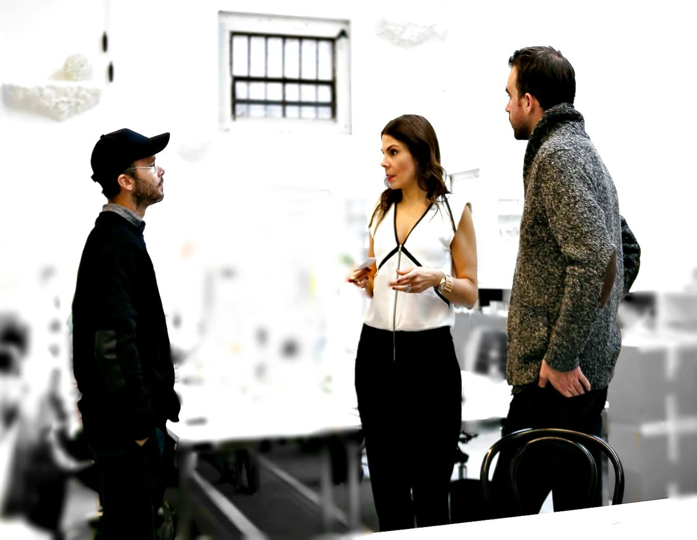
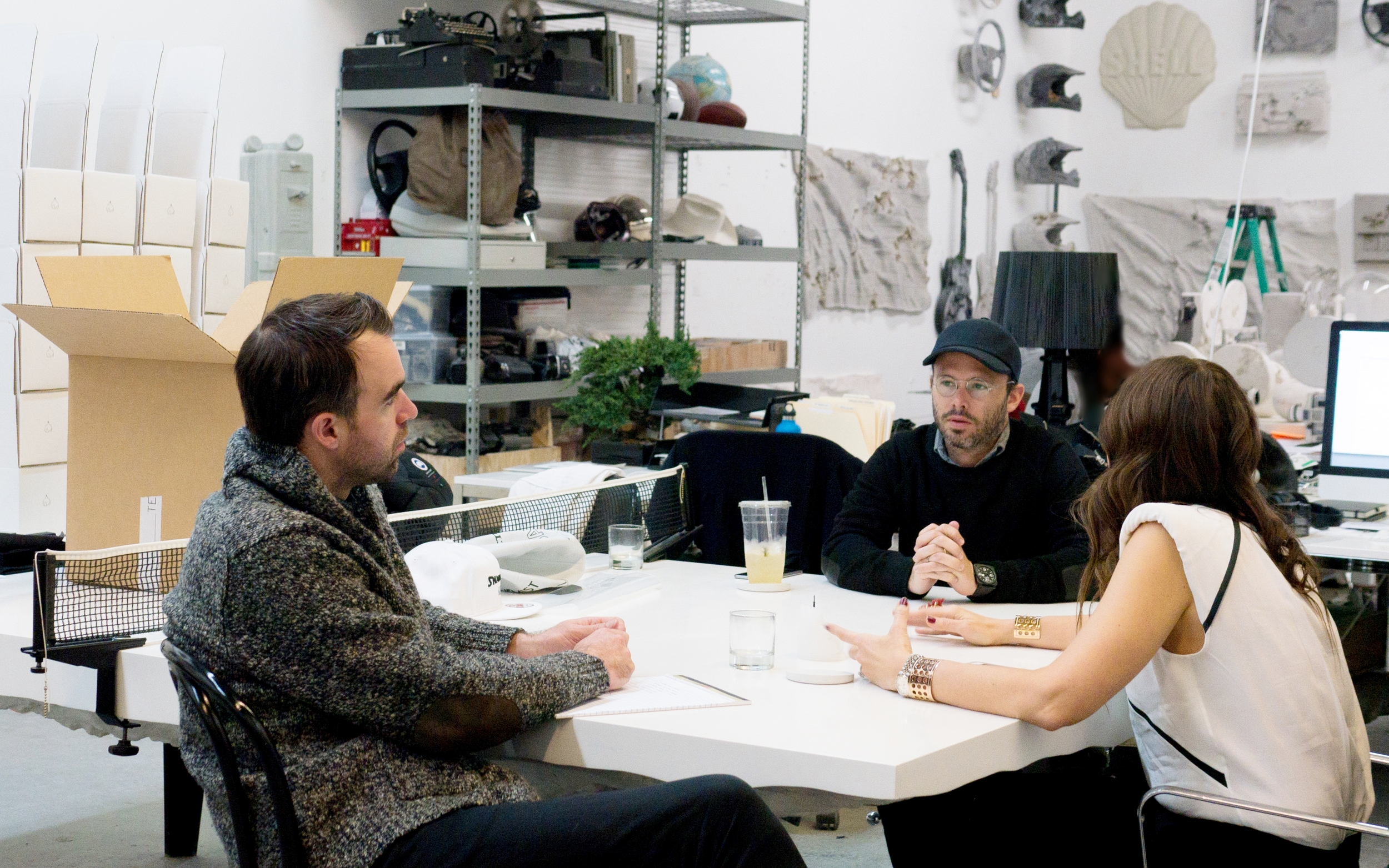
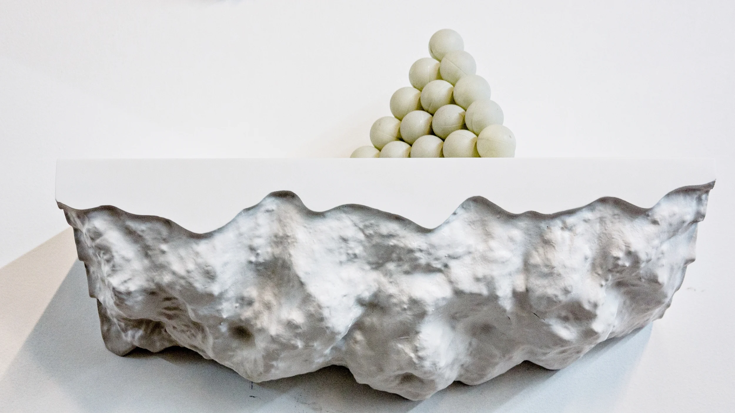
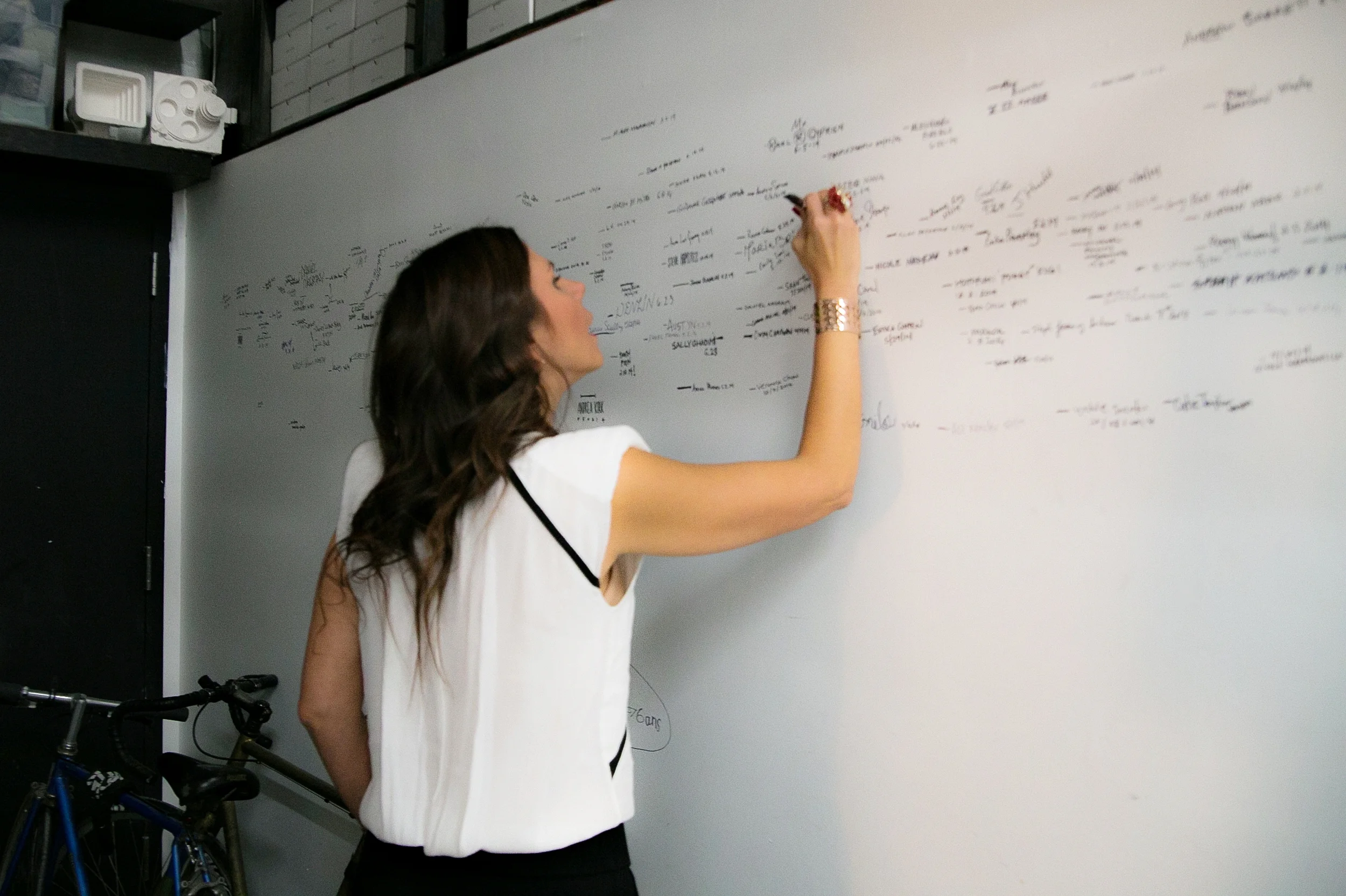
For a person like me, who thrives in bold color combinations and patterns, it's fair to say that the monochromatic black and white palette that is almost always used by Snarkitecture took me out of my comfort zone – and captivated me. Daniel Arsham and Alex Mustonen, the brains behind Snarkitecture, welcomed me last week in their Brooklyn studio where we discussed their many projects, past, present and upcoming. In their work, the focus shifts from distracting hues to the thousands of possibilities contained in materials.
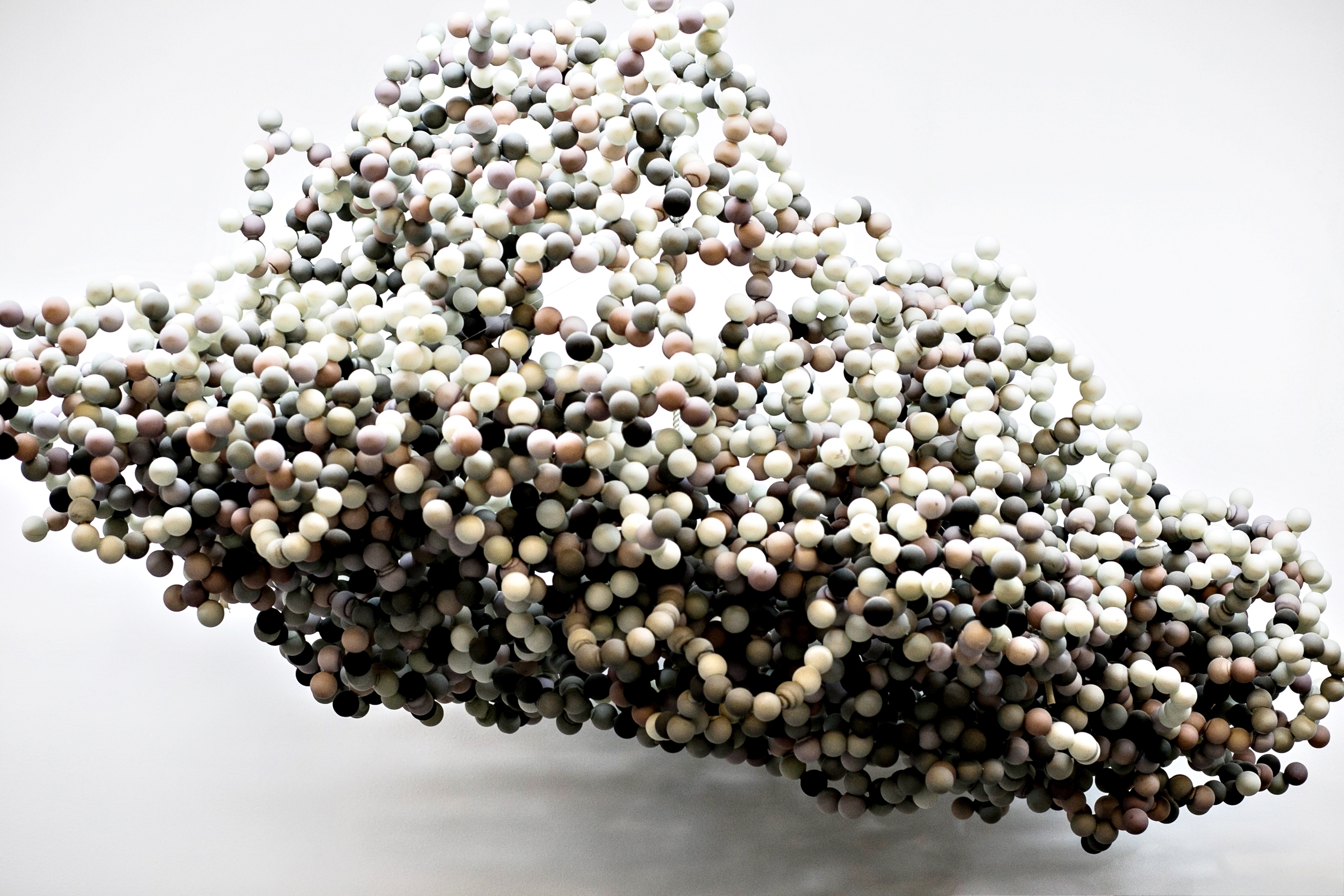
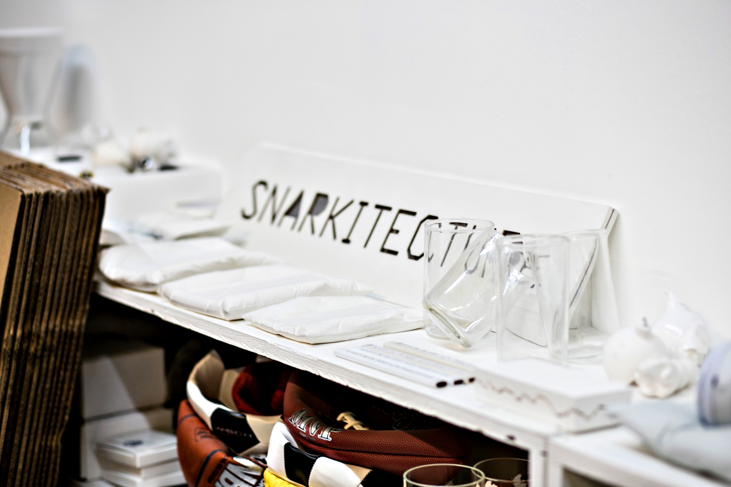

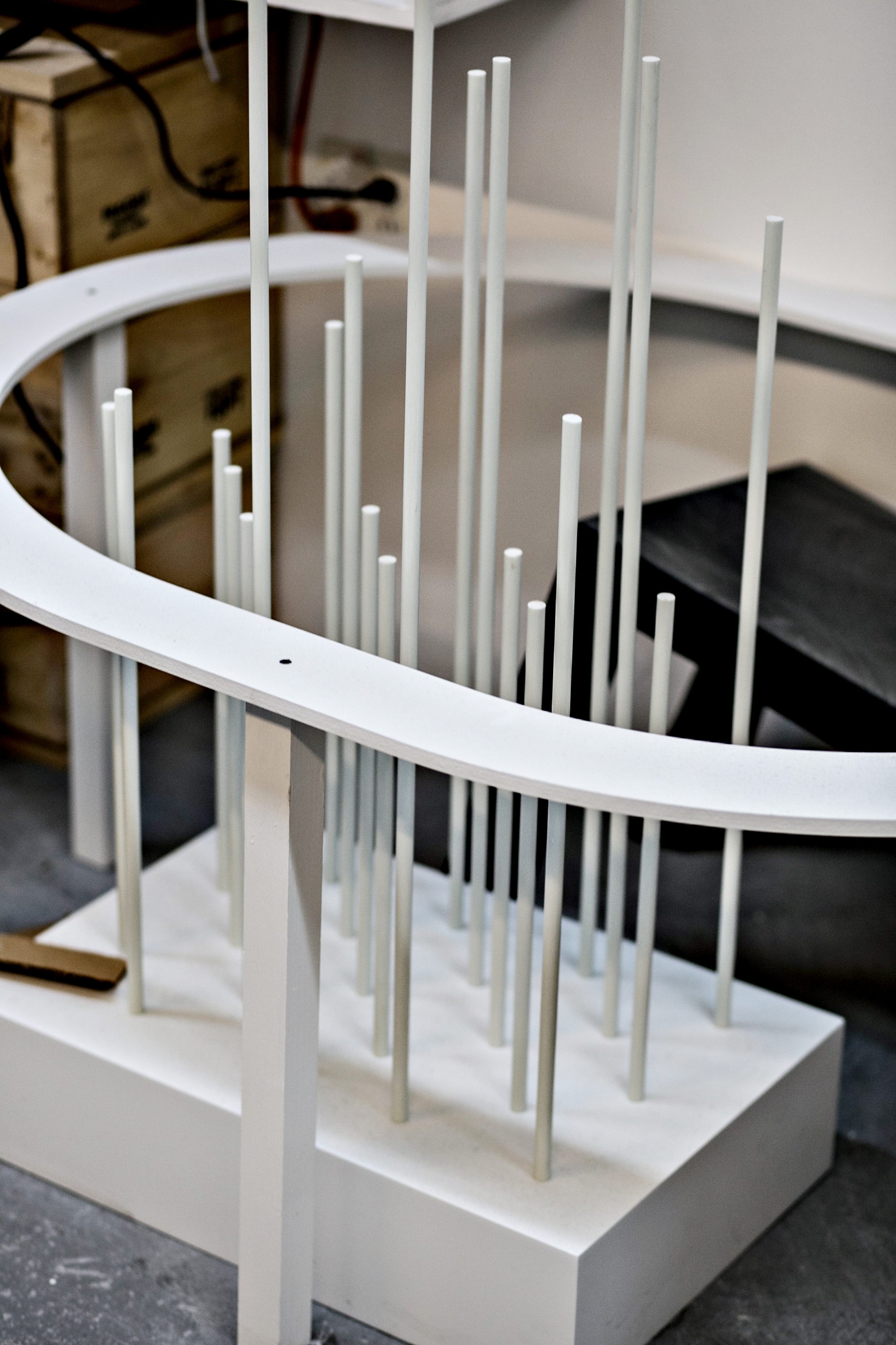
The two men have been collaborating since 2008 and have grown their practice under the support of clients and mentors who understand the value of cross-pollination between the disciplines of design, art, and architecture. From small objects to furniture to site-specific installations, there seems to be no area where these guys aren't willing to go.
I asked which projects have marked their big breakthrough and they seem to agree that both the 2010 pop-up store that they built for Richard Chai at the High Line as well as the 2012 installation they did for the pavilion entrance of Design Miami, which entailed hundreds of inflated vinyl tubes suspended from the ceiling, were important milestones in their career.
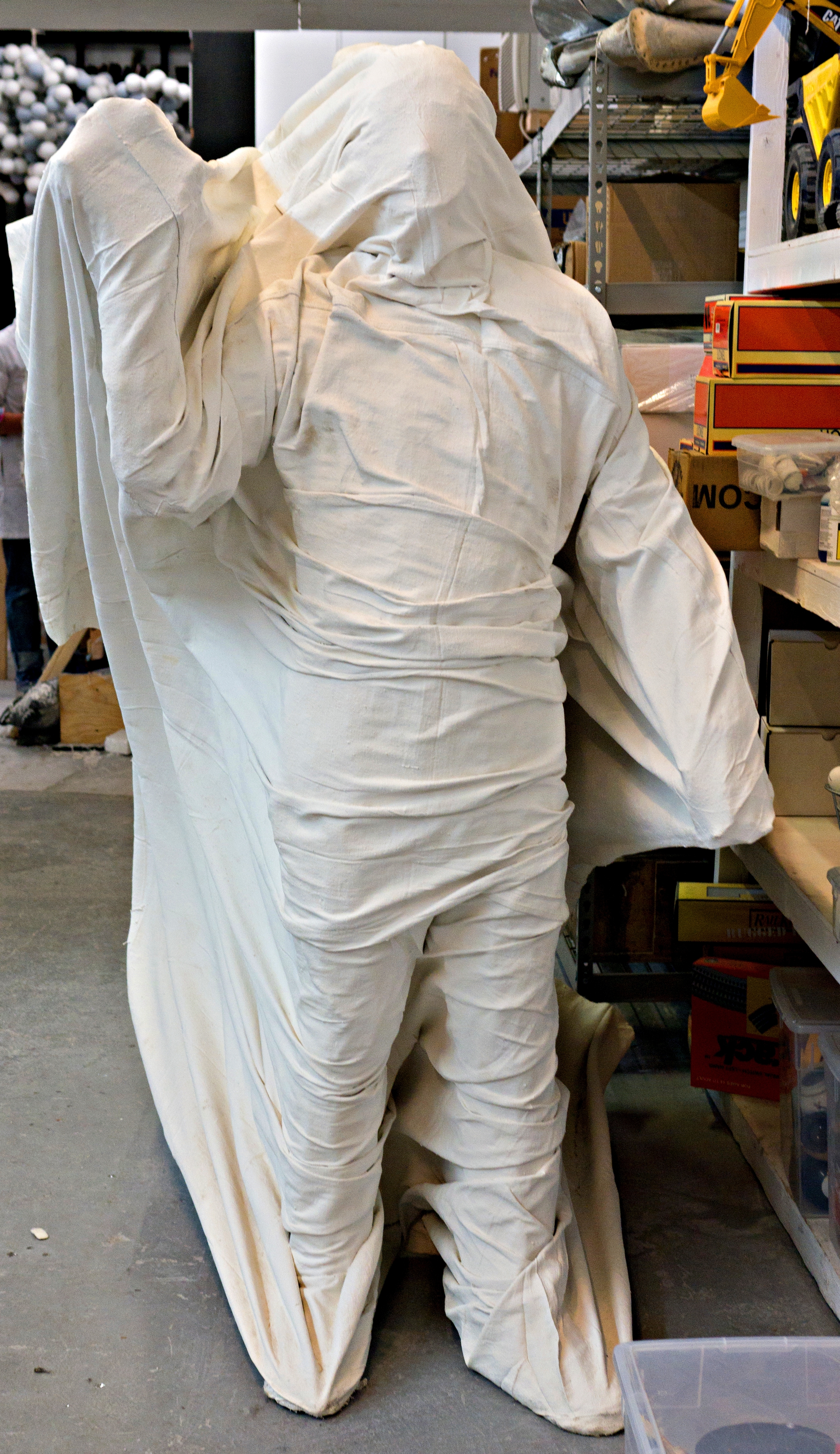
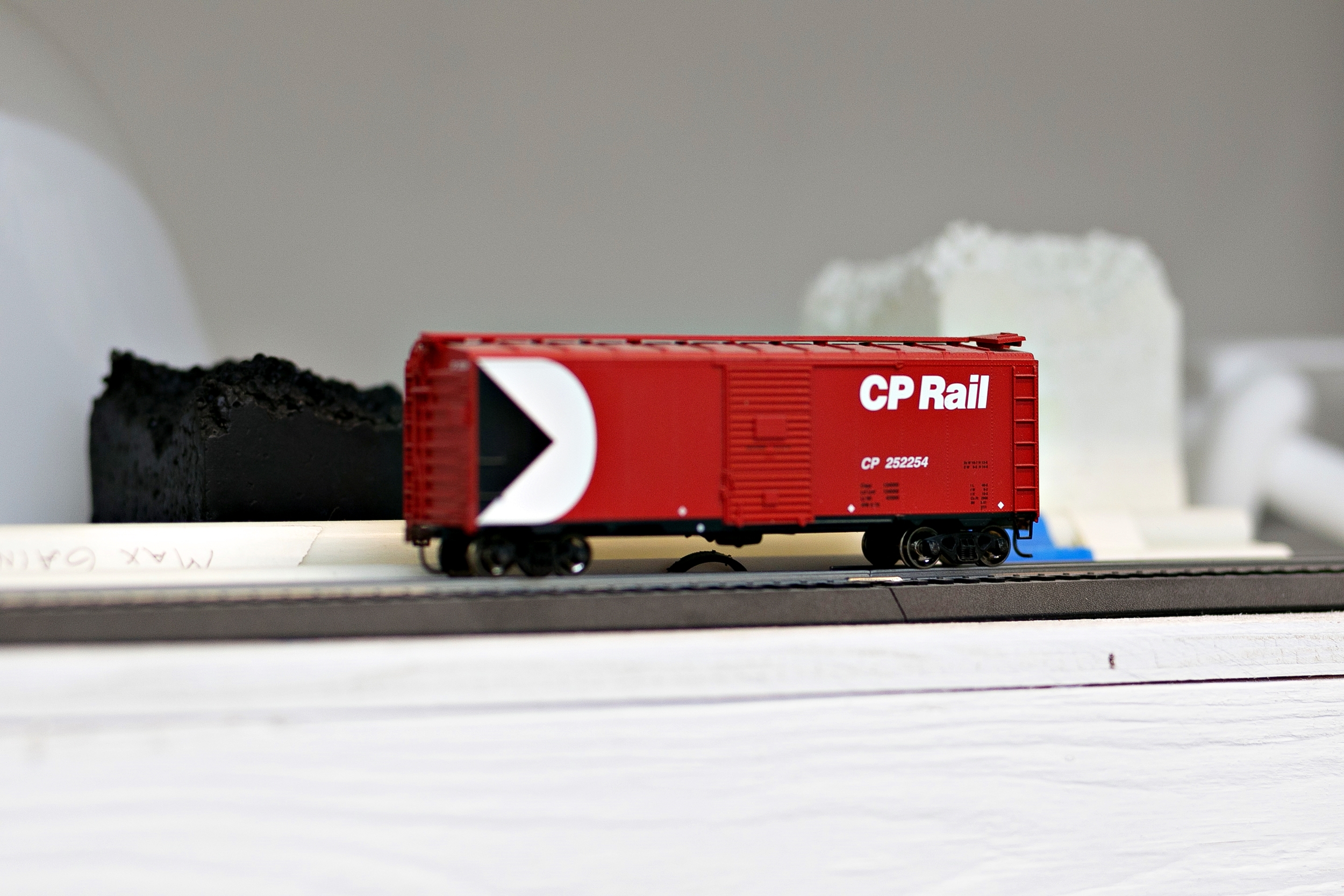
Daniel, who as an artist has created meticulous sculptures made of broken glass - even using Pharrell as a model for the show he curated at Galerie Perrotin in Paris last summer - is also a filmmaker. From the development and pre-production to directing people he really admires such as James Franco and Juliette Lewis, Daniel believes his films are among his most fulfilling projects. Future Relic has been shot in nine parts, two of which have already been released.
While chatting with Alex, he told me that he thinks of Snarkitechture as a "rational dreamspace" - a place to create and alter daily objects and to find new relationships with materials and with things around us, whether deliberately or accidentally.
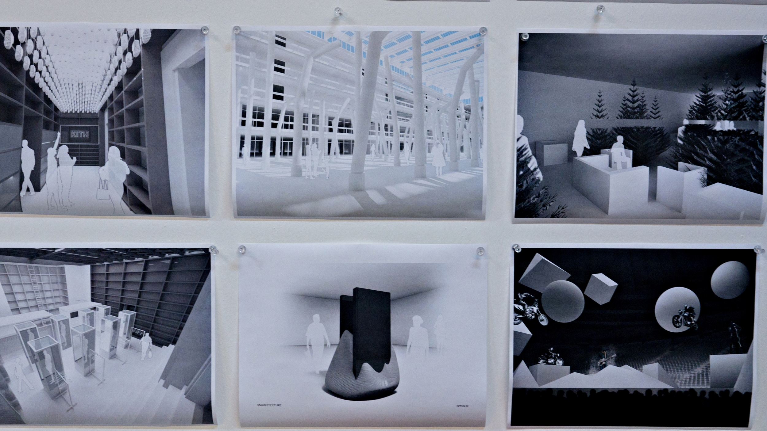
There are so many projects happening simultaneously for these guys, starting with the window displays at Calvin Klein's flagship store on Madison Avenue unveiled this past Friday to several music-related collaborations such as designing album covers and building music video sets that will be announced in 2015.
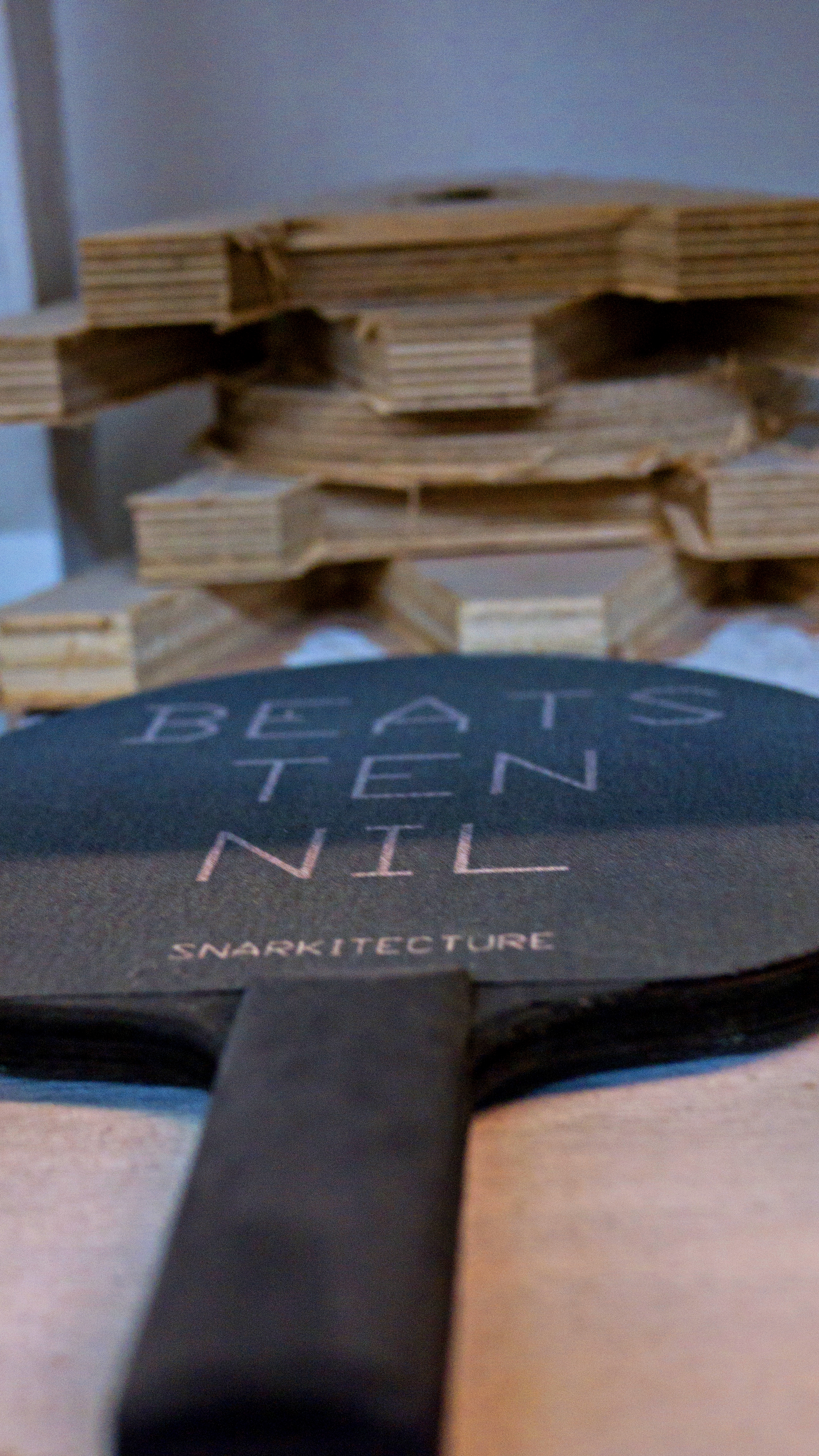
But it is at the upcoming Art Basel Miami Beach where two Snarkitecture projects will coexist in parallel. One is AIRBALL, a custom basketball-inspired installation adjacent to the Alchemist space on Lincoln Road at the Herzog & de Meuron designed carpark, and the other project is in the lobby of the iconic Delano South Beach, where Daniel and Alex created a custom marble-run installation that people can interact and play with.
With their originality, humor and refreshing take on materials and objects, I would not be surprised if Snarkitecture ends up designing entire cities in the future. Meanwhile, we can all enjoy what’s in the present and in the immediate future realm.

